Enter password to view
Onto Companion
Transforming Onto’s app into a scalable subscription companion
My role
Product Design Lead
Company
Onto
Themes
Overview
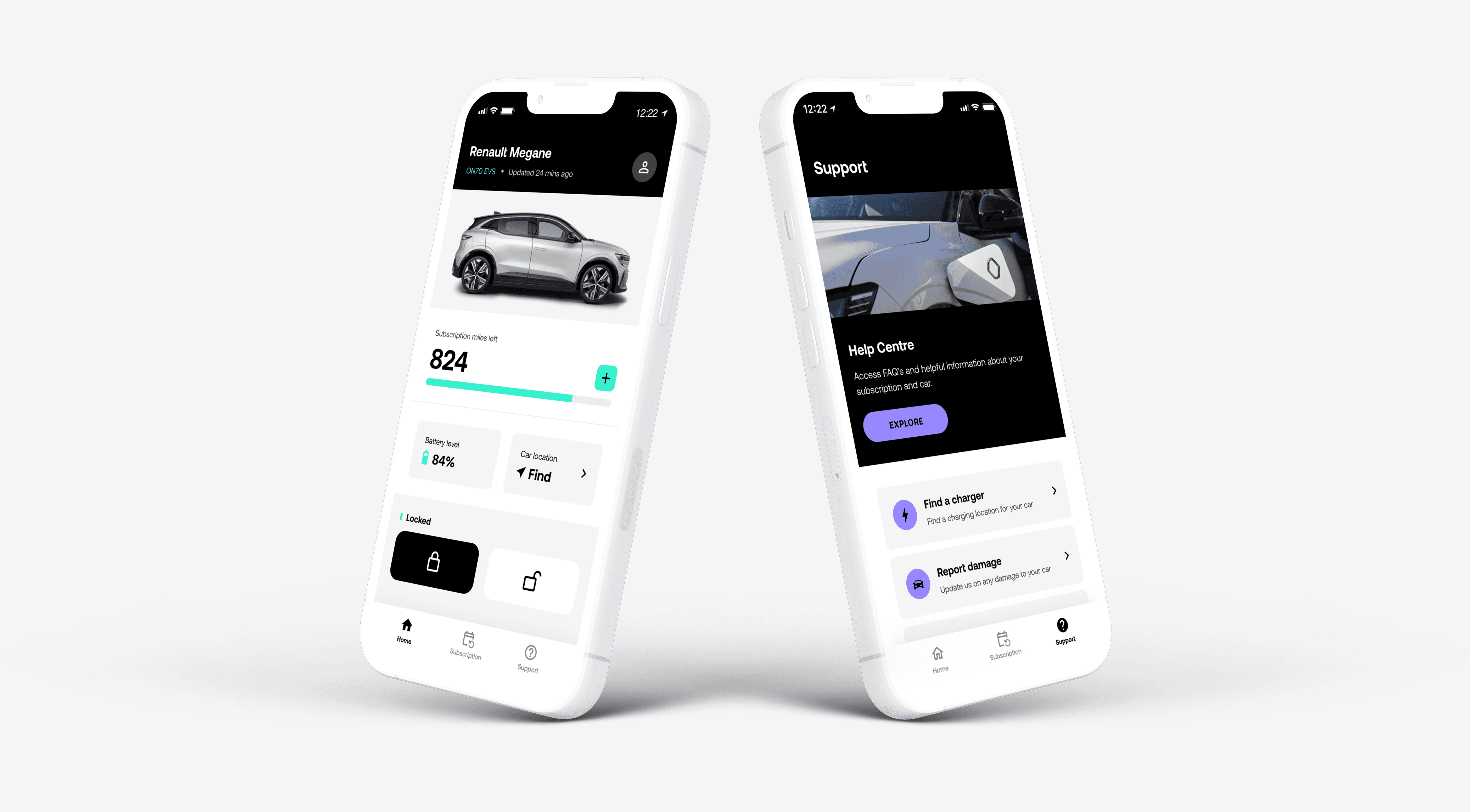
Onto’s app had grown from a keyless car access tool into a broader subscription product - covering plan management, rewards, charging and support - but the experience hadn’t scaled with it.
The result was a fragmented app that created friction across core journeys, reduced confidence in key features and increased reliance on customer support.
I led an end-to-end redesign, aligning product, engineering and brand around a clearer app structure, refreshed UI and scalable design system - repositioning the app as a subscription companion that could support customers across the full lifecycle.
+30%
4.4*

Reframing the problem
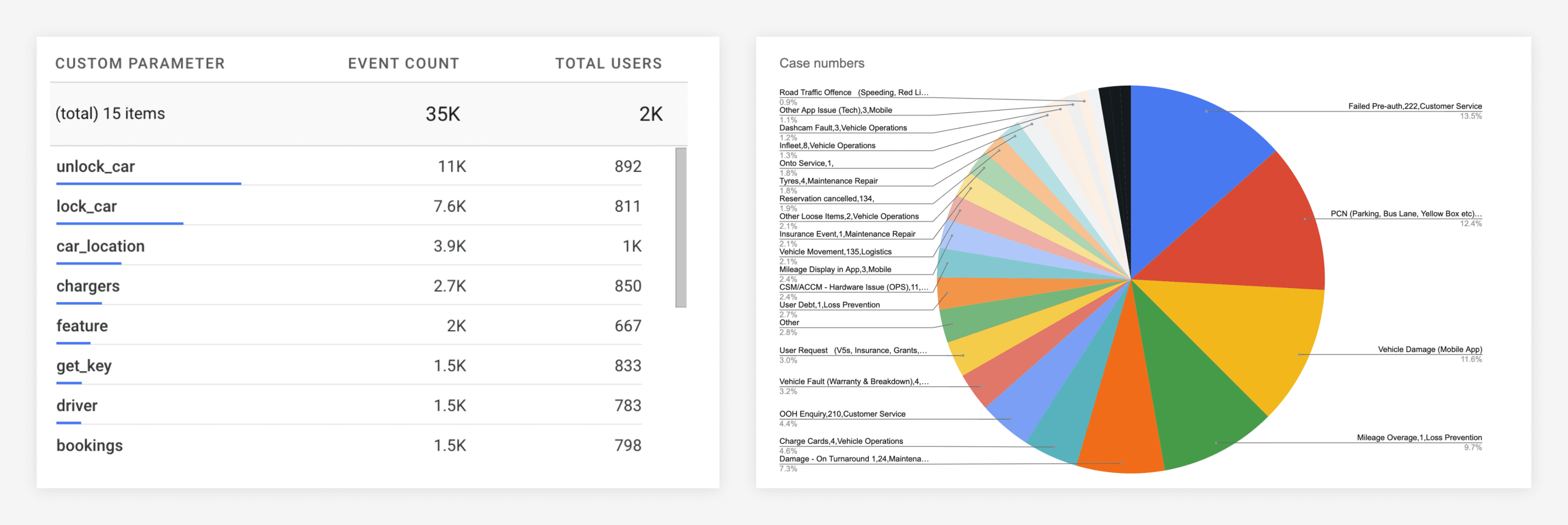
I combined behavioural analytics, customer service data, UX reviews and user research to understand where the experience was breaking down and which problems had the greatest impact.
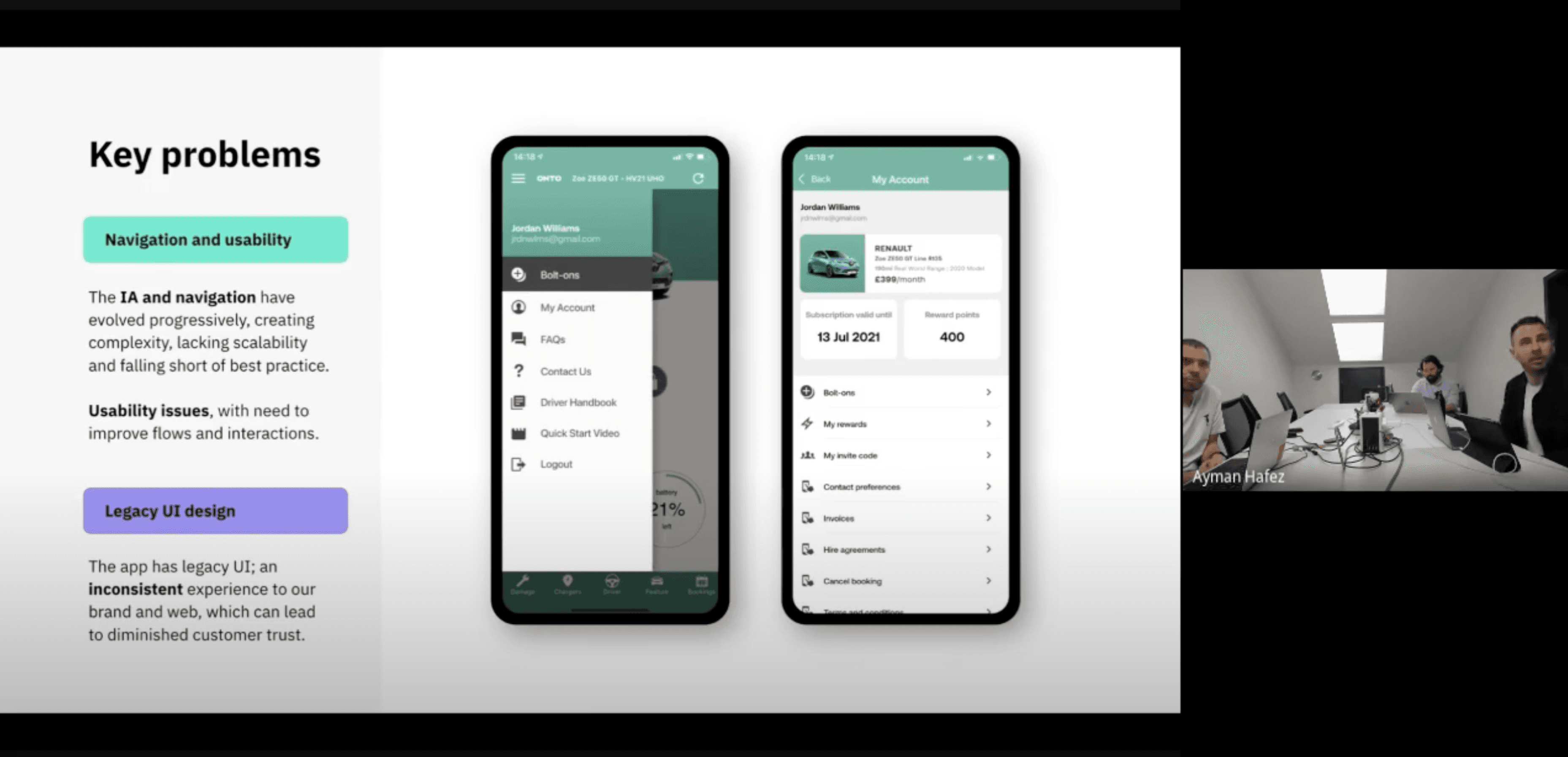
A clear theme emerged - while Onto’s feature set had grown, the app still behaved like a single-purpose utility rather than a subscription platform.
Key issues included:
Fragmented navigation and information architecture
Unreliable car data reducing trust in core features
Subscription tools scattered across the experience
Limited in-app support, increasing operational load
A dated UI lacking scalability and brand cohesion
The opportunity was to move from a functional access app to a cohesive subscription companion - improving usability, engagement and operational efficiency.
Grounding in customer behaviour
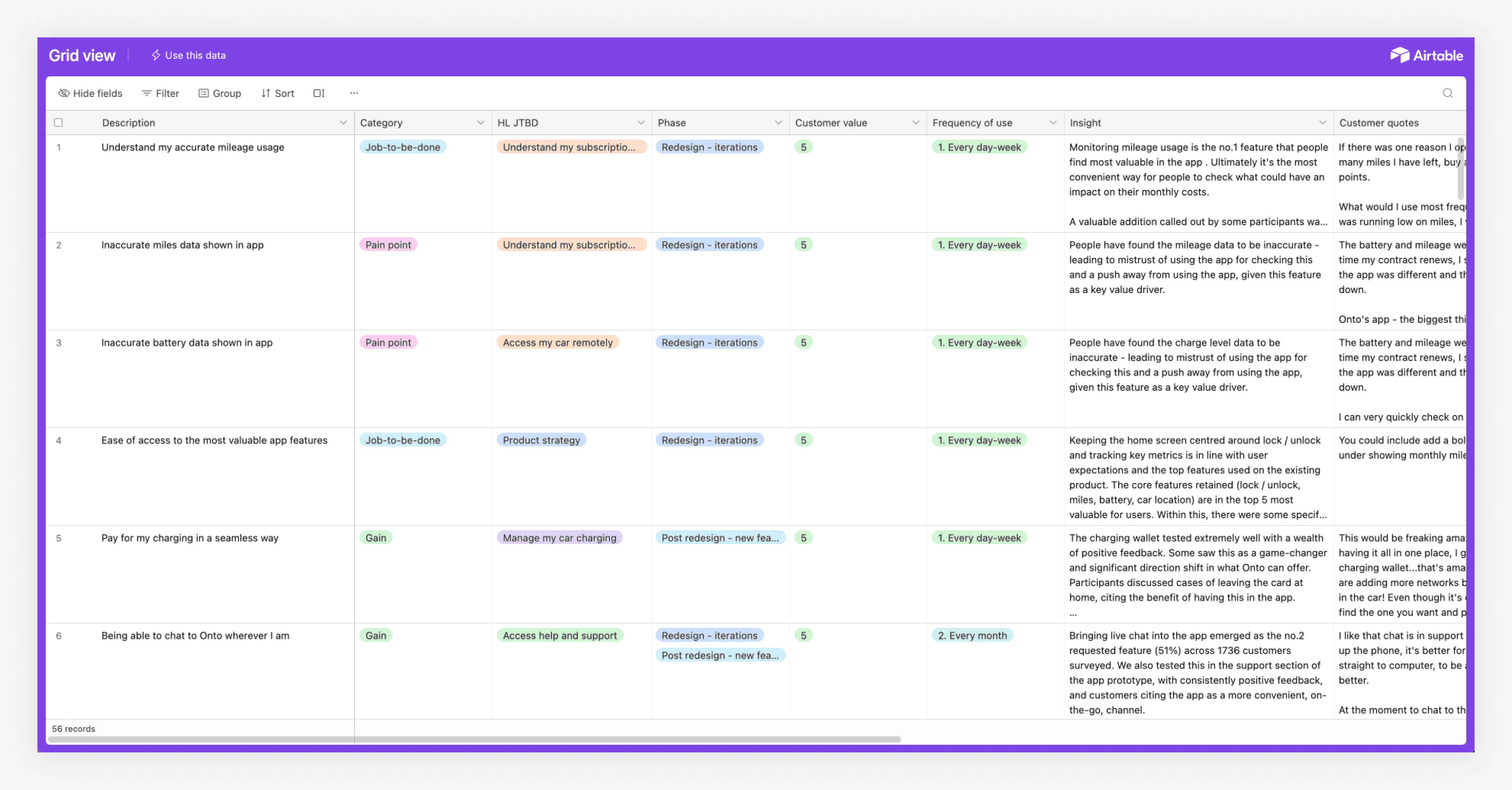
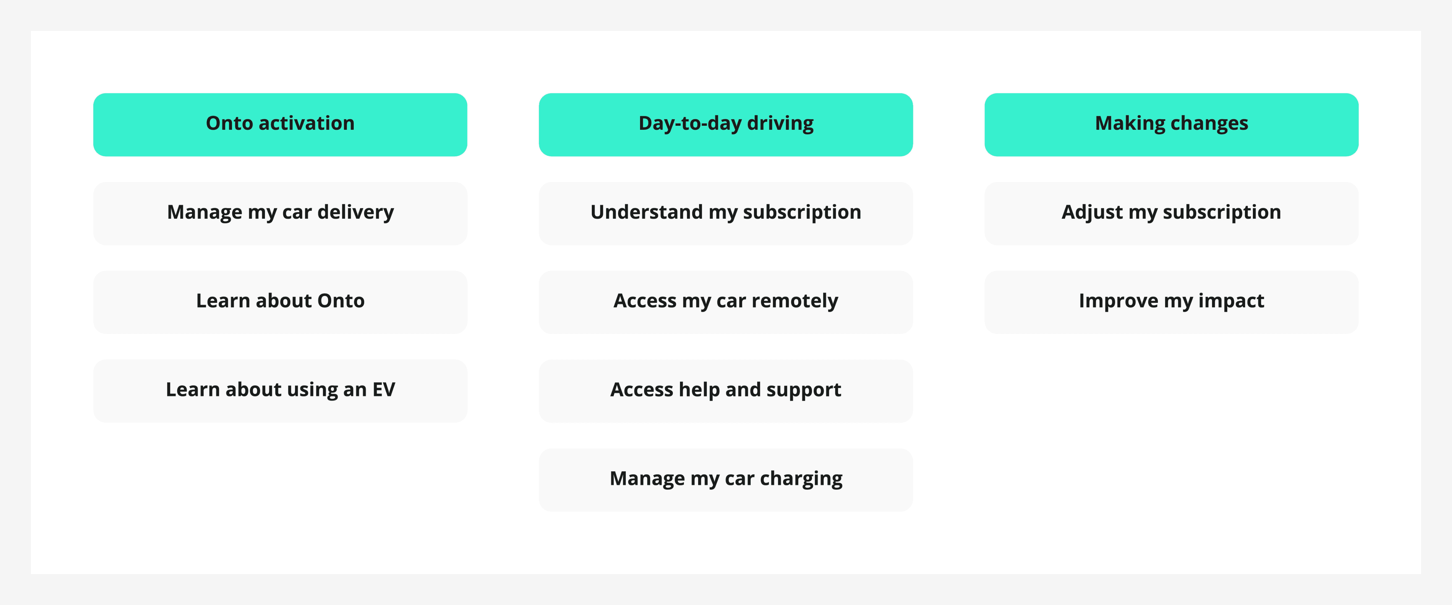
I ran interviews and iterative testing with 16 customers, exploring pain points around electric vehicle ownership, subscription management and everyday app use.
These sessions helped prioritise the journeys that mattered most and gave the team a shared framework for the redesign - aligning design, product and engineering around the highest-leverage problems to solve.
Setting the strategy
I aligned the team around four goals:
Simplify navigation and core journeys: create a clearer structure that could scale with Onto’s growing feature set.
Strengthen the connection to the car: make key vehicle information more reliable, visible and trustworthy.
Make subscription management a core experience: give customers clearer control over plans, rewards and add-ons.
Bring the new brand into the product: translate Onto’s refreshed identity into a distinctive, cohesive app experience.
Reduce cost to serve through in-app support: shift common support needs into self-service and real-time chat.
Underpinning these goals was a new design system to improve consistency, accelerate delivery and support future product growth.
Simplifying navigation and experience structure
The existing information architecture had grown organically, creating cognitive load and friction across everyday tasks.
I led a full restructuring of the app experience, using behavioural data, card sorting and tree testing to define a simpler tab-based navigation model. Key shifts included:
Grouping car-related actions and issue reporting into a unified support surface
Bringing subscription management into a dedicated, high-visibility area
Clarifying core journeys so common tasks could be completed in fewer steps
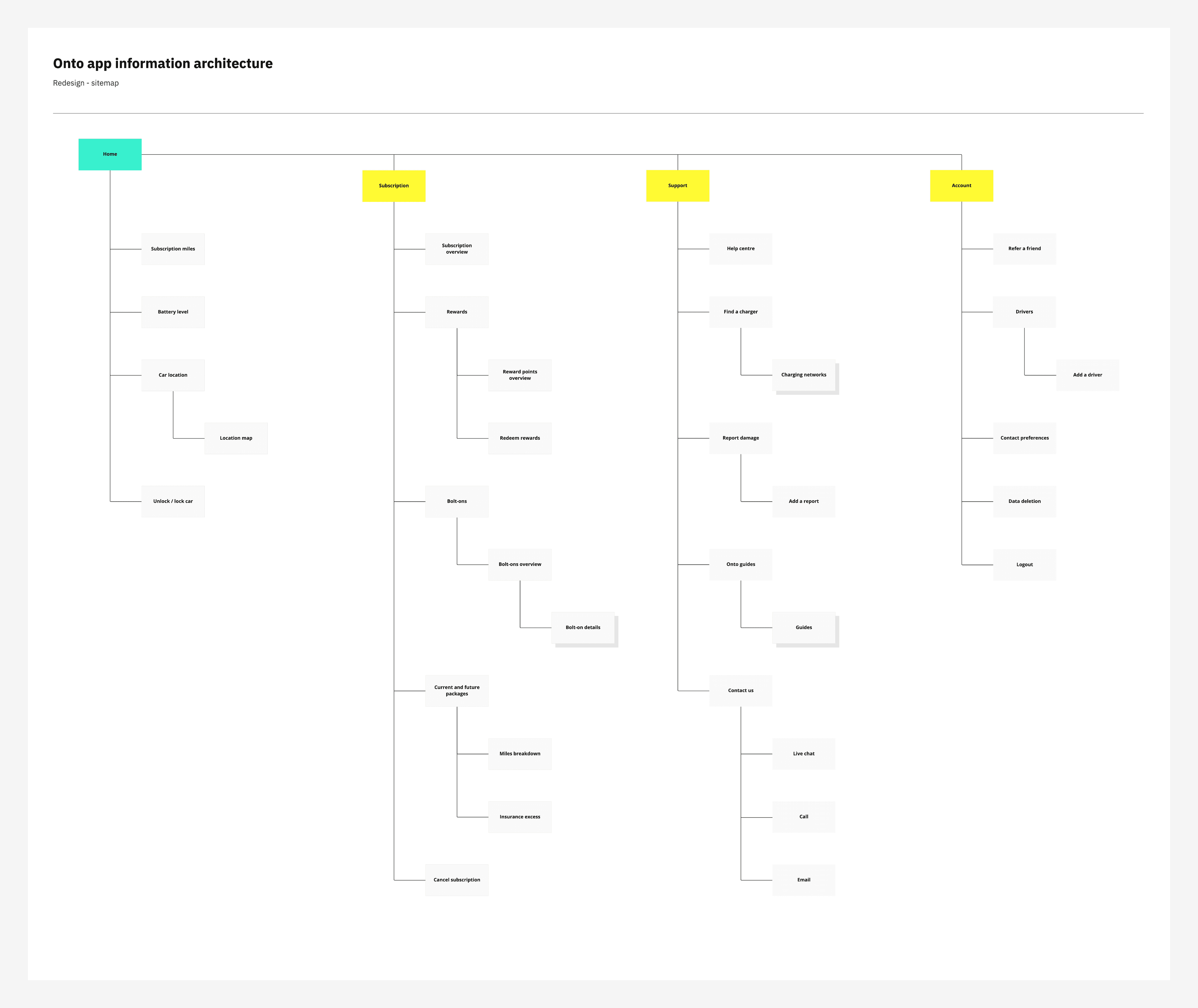
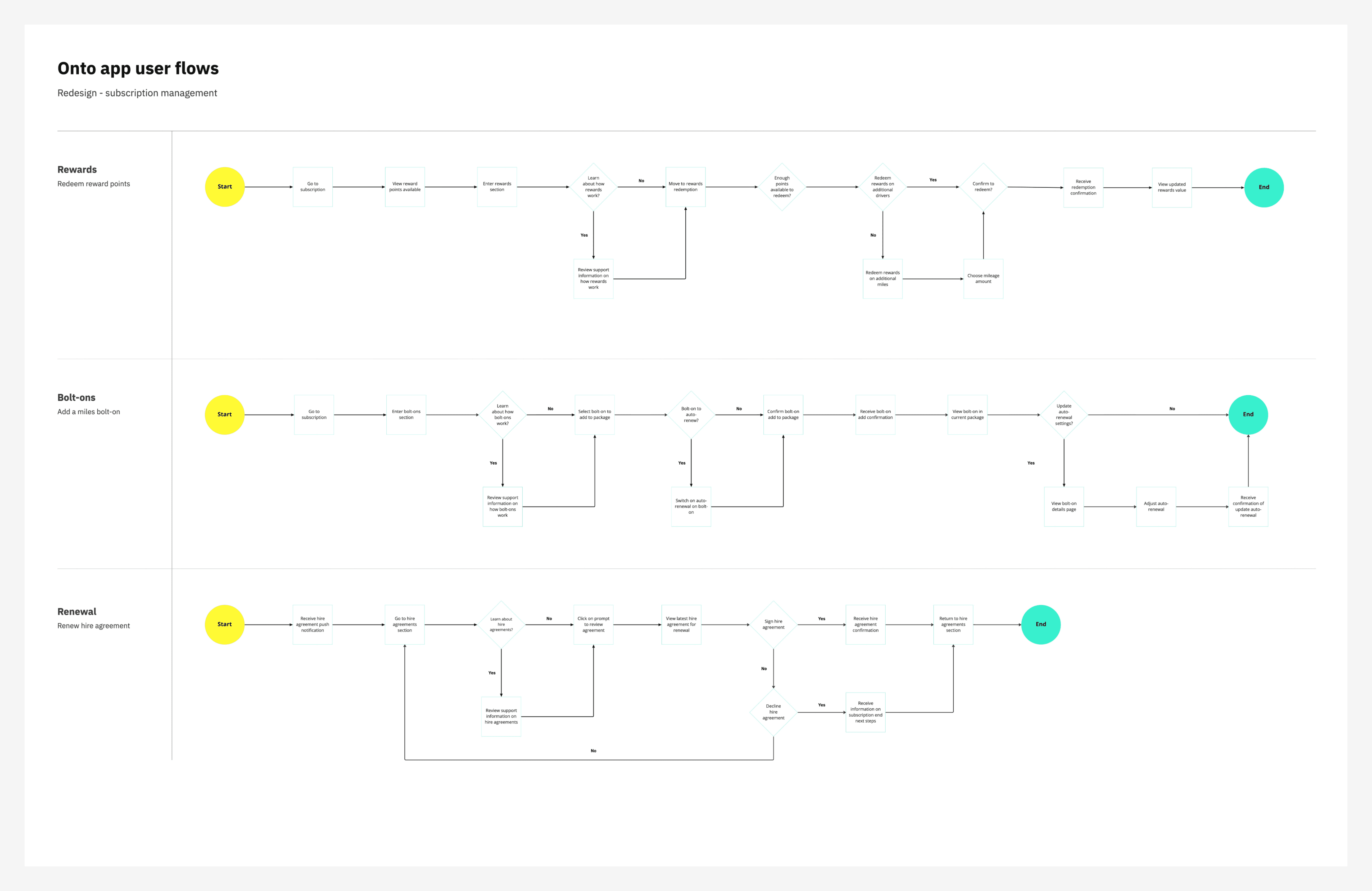
Together, these changes created a clearer end-to-end structure for the experience - improving usability, feature discoverability and confidence across core journeys.
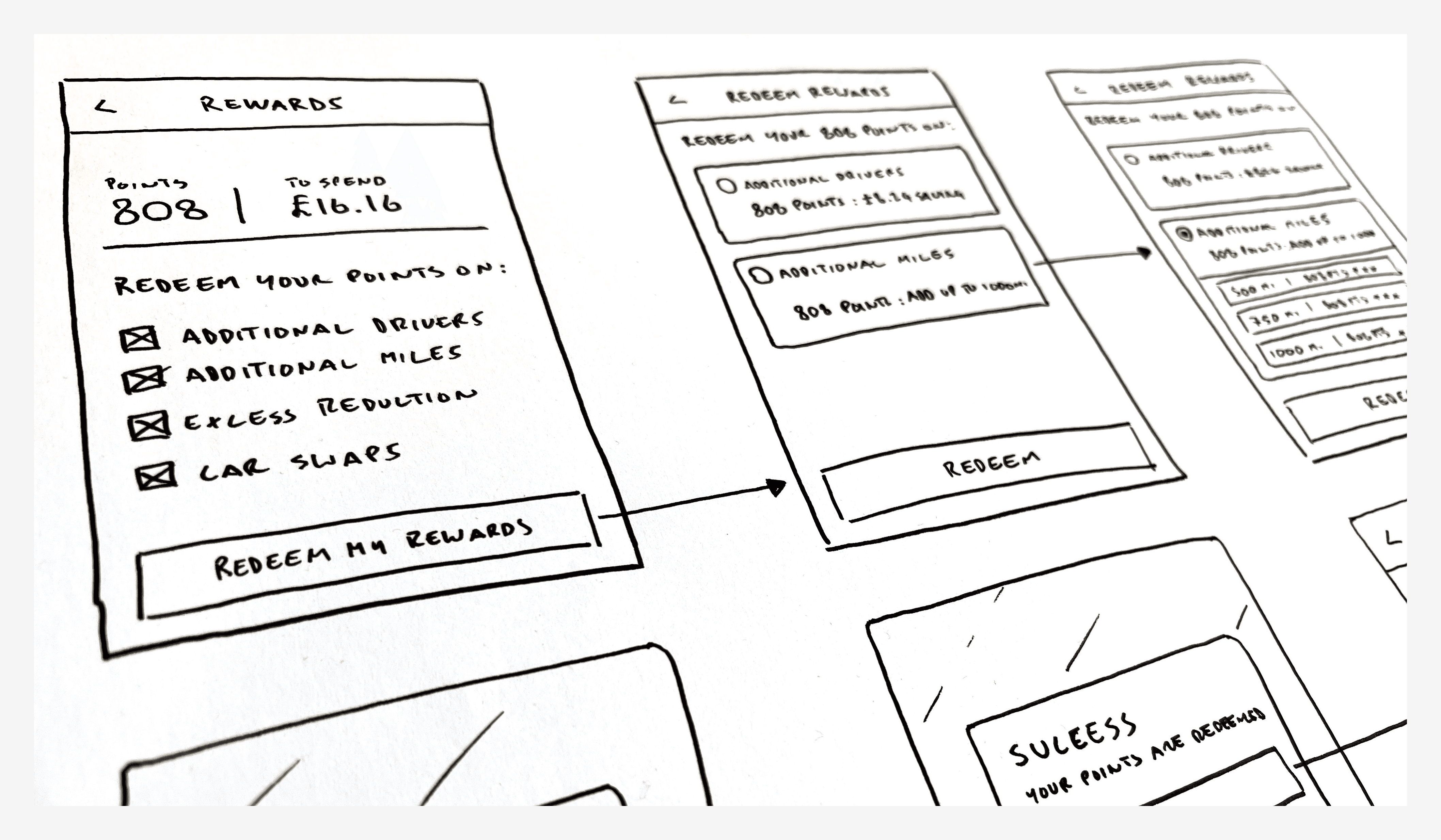
I used rapid ideation and prototyping with the product squad to stress-test complex journeys early, with customer job stories keeping each feature anchored to a clear user outcome.
Building a system for scale
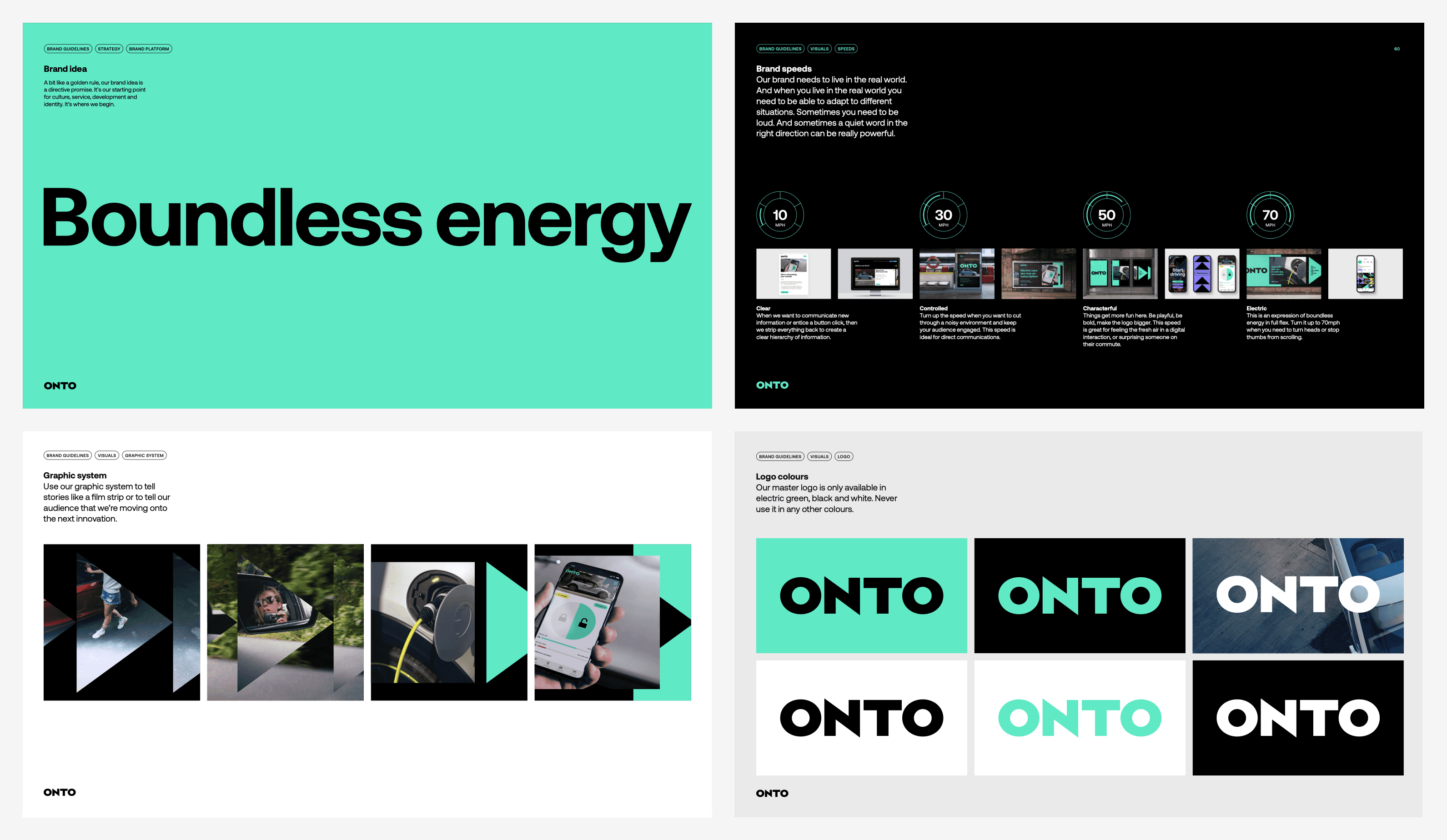
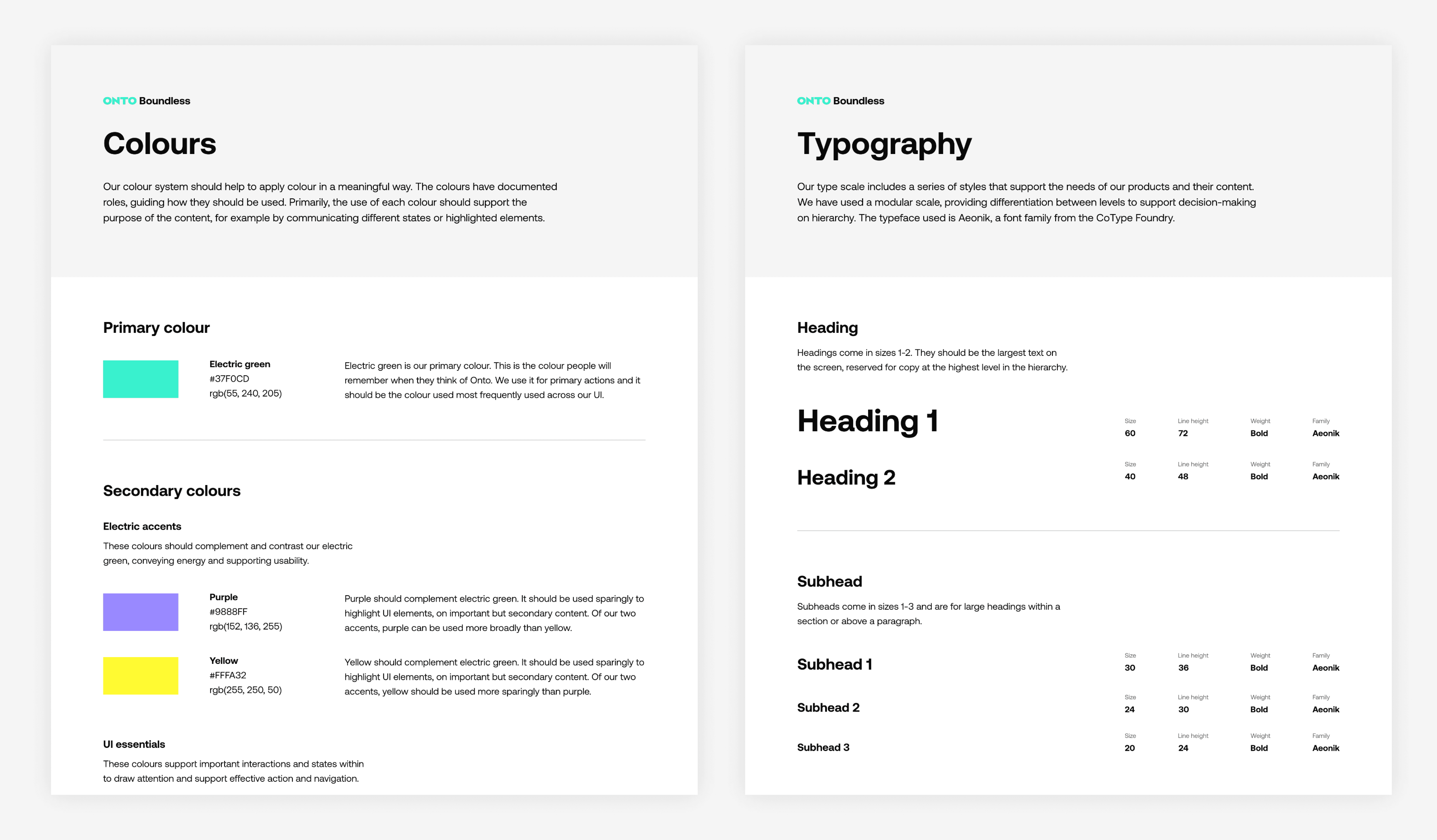
Onto’s visual identity had been reimagined with Ragged Edge. I translated the refreshed brand into a component-based UI system that balanced bold visual expression with functional clarity.

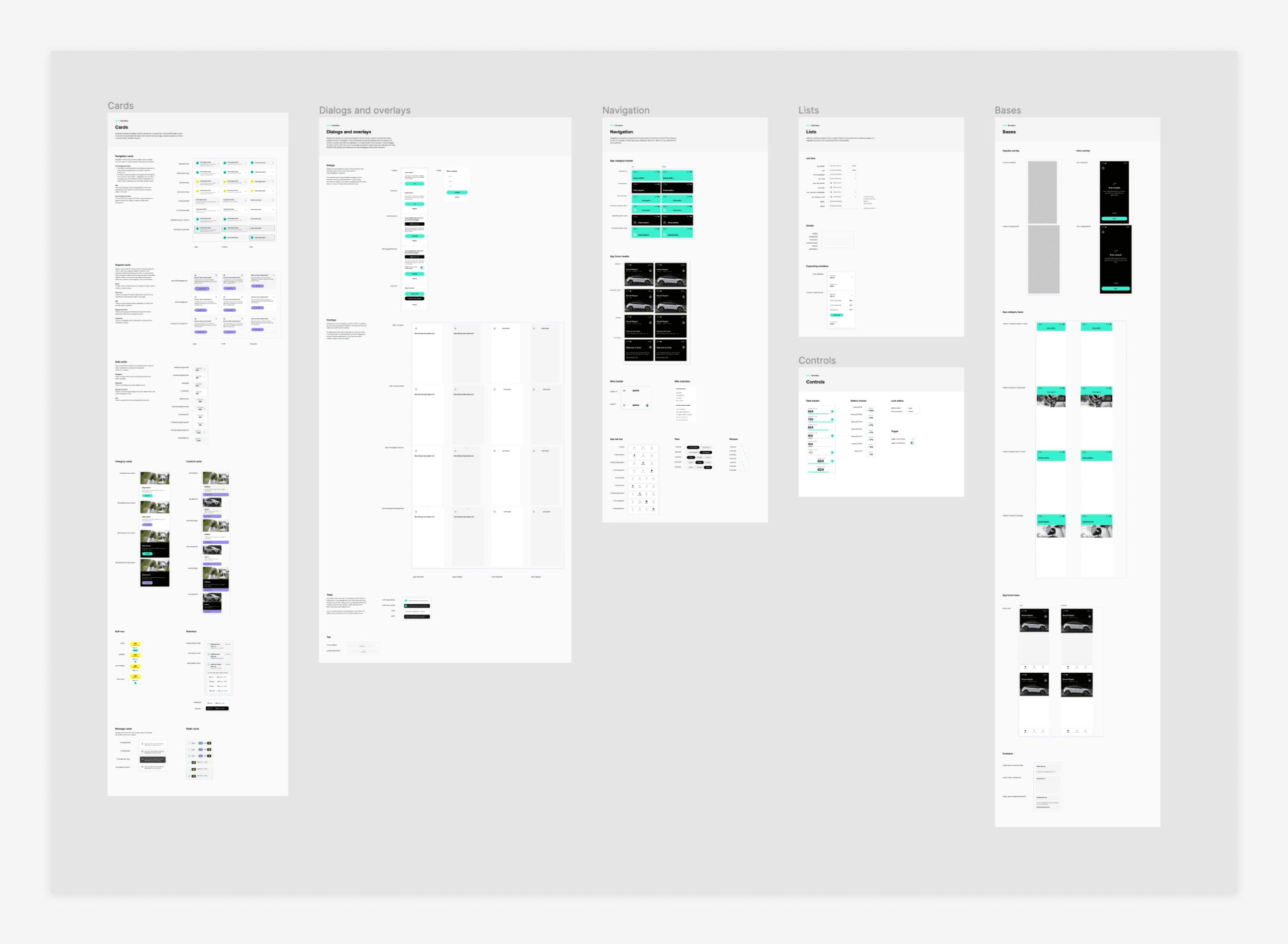
Alongside this, I led the creation of a new design system in close partnership with engineering. Built as shared product infrastructure, it improved consistency, accelerated development and enabled faster experimentation.
The system reached 90% component coverage, becoming the foundation for ongoing product evolution and future feature delivery.
Strengthening connection to the car
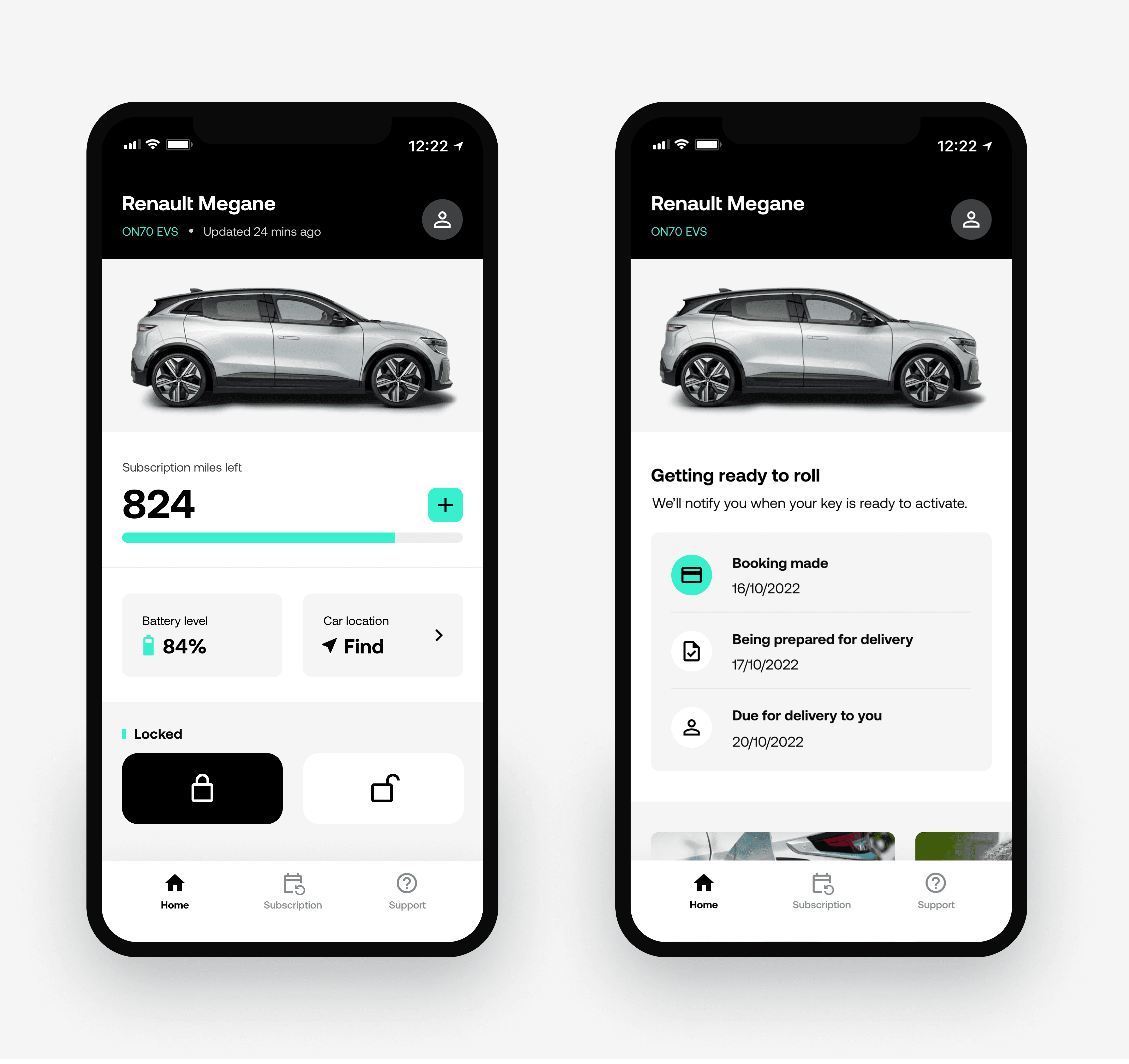
At the heart of the redesign was a new home experience centred on the customer’s real-time connection to their vehicle.
We prioritised the information customers cared about most battery level, remaining range, location and access - and improved telematics synchronisation to make live data feel more reliable and trustworthy.
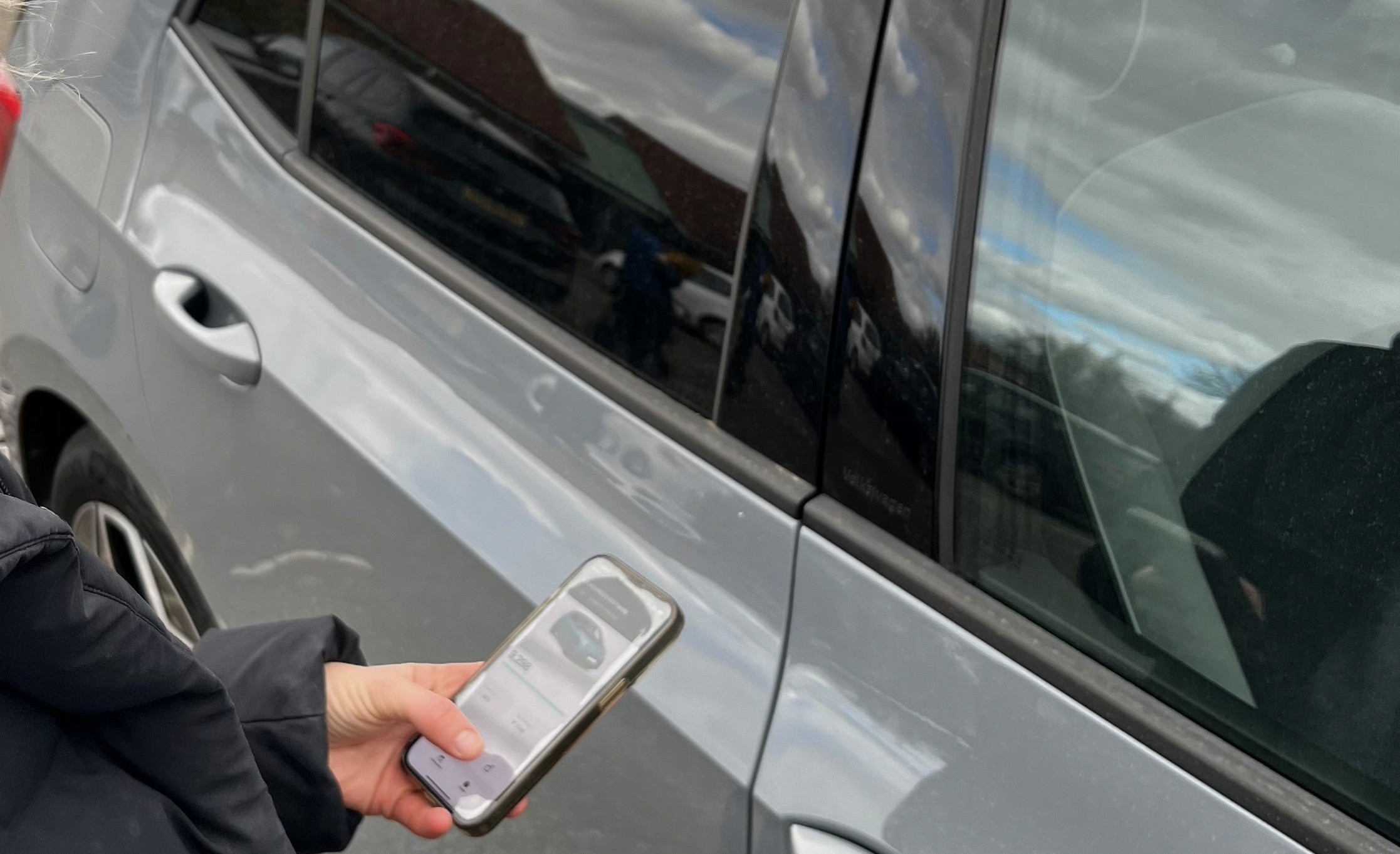
We also refined digital key interactions to reduce dependence on physical keys and better support car sharing.
Improved data accuracy became a major driver of satisfaction, contributing to higher engagement and a meaningful reduction in customer support cases.
Subscription management at the core
Previously, subscription features had been added piecemeal and sat across the app. Behavioural analytics and customer testing showed these tools were both highly used and naturally grouped around common customer tasks.
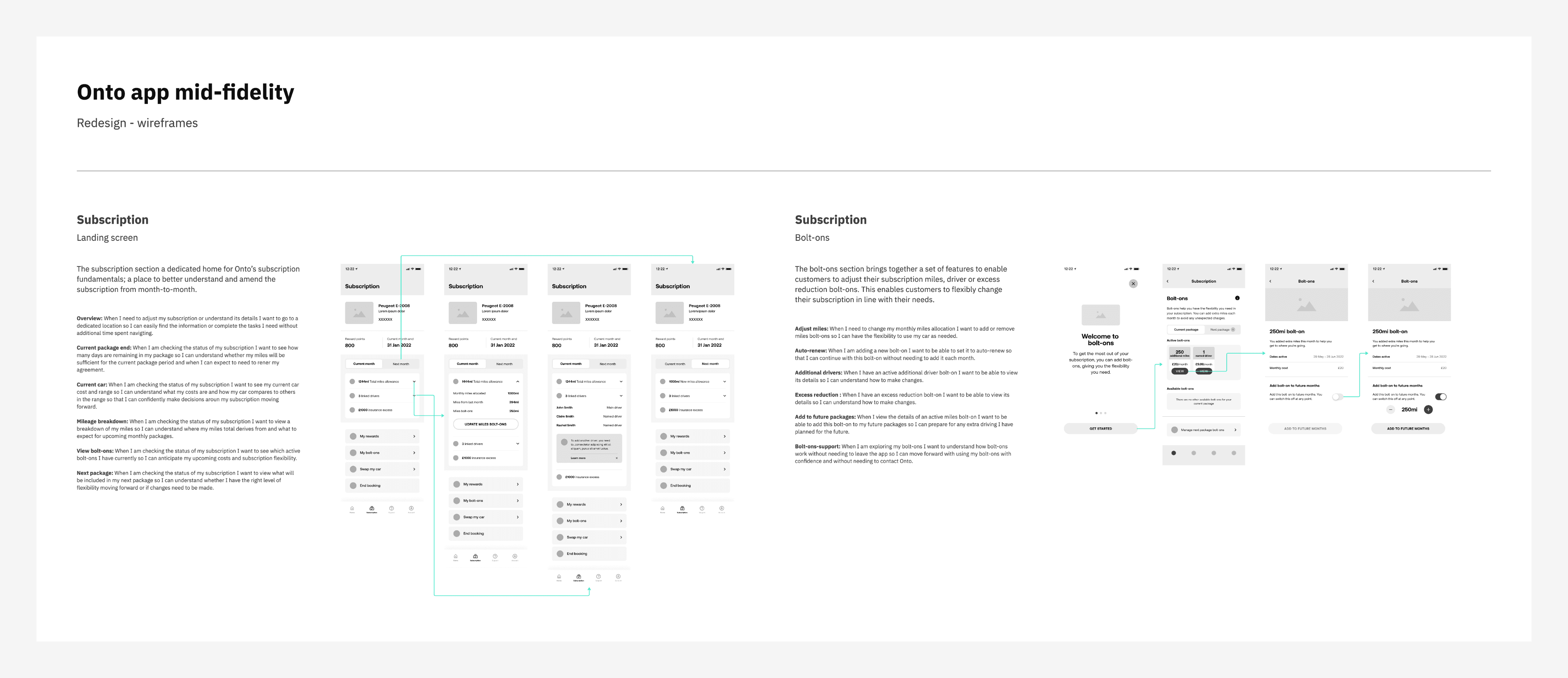
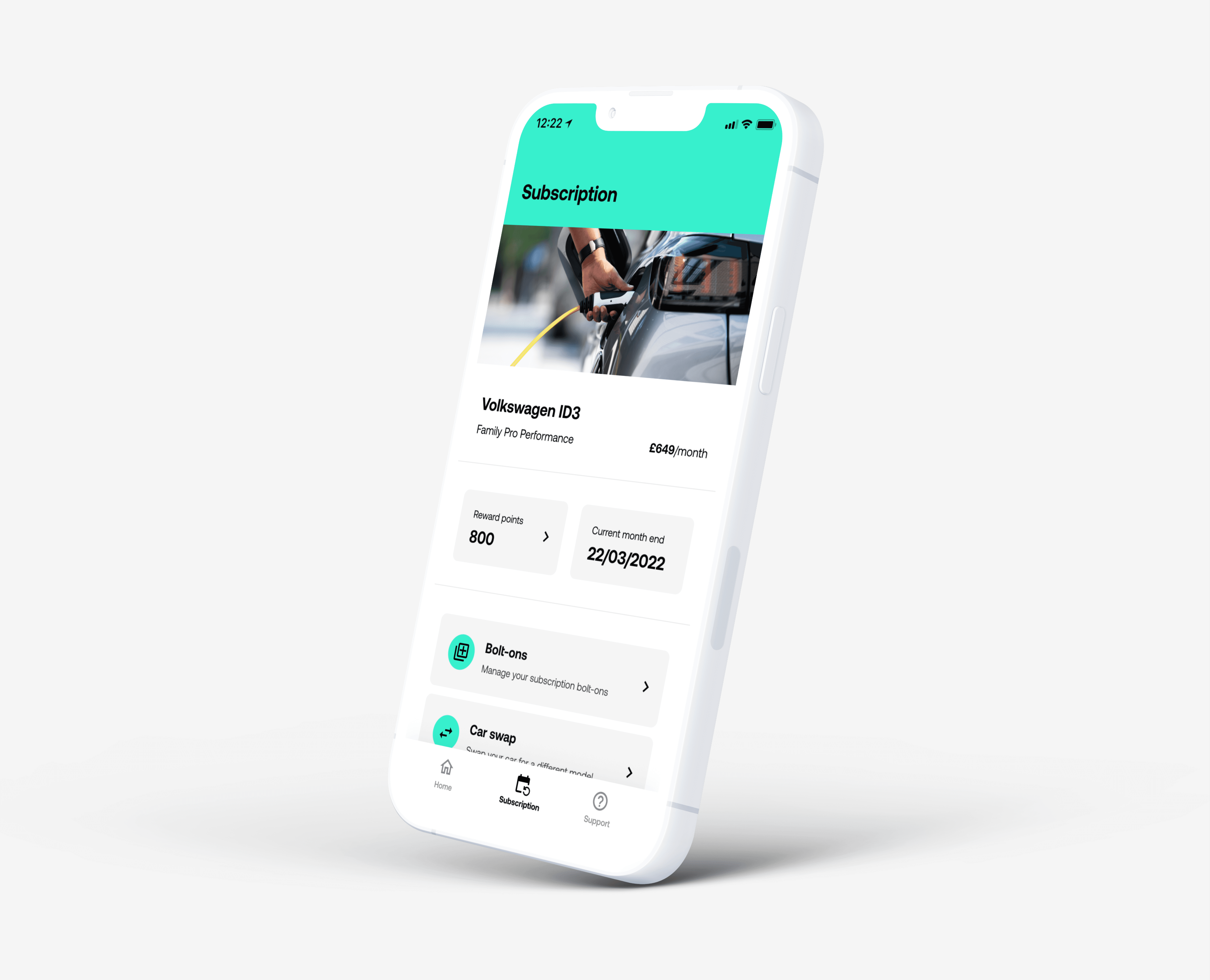
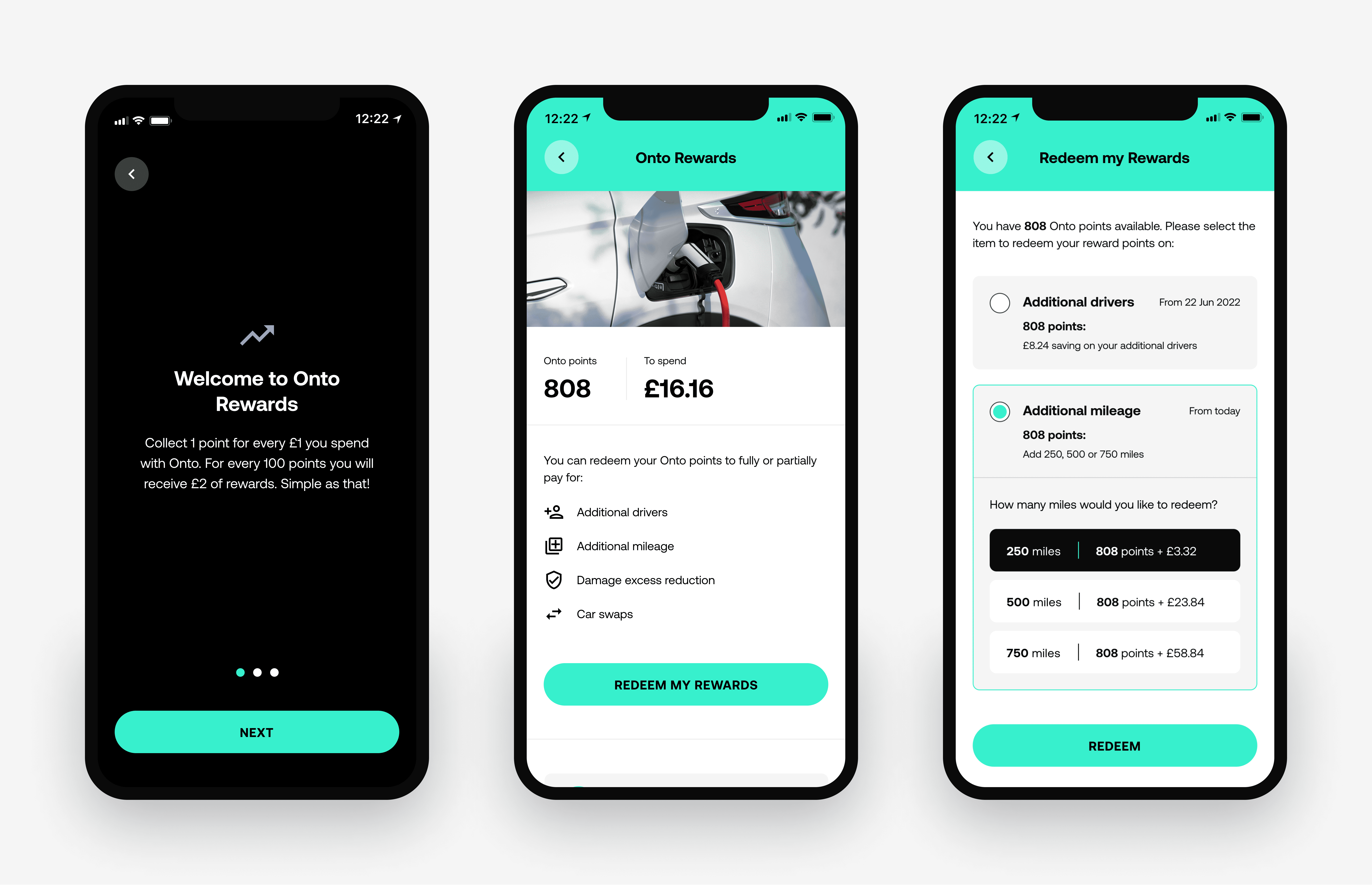
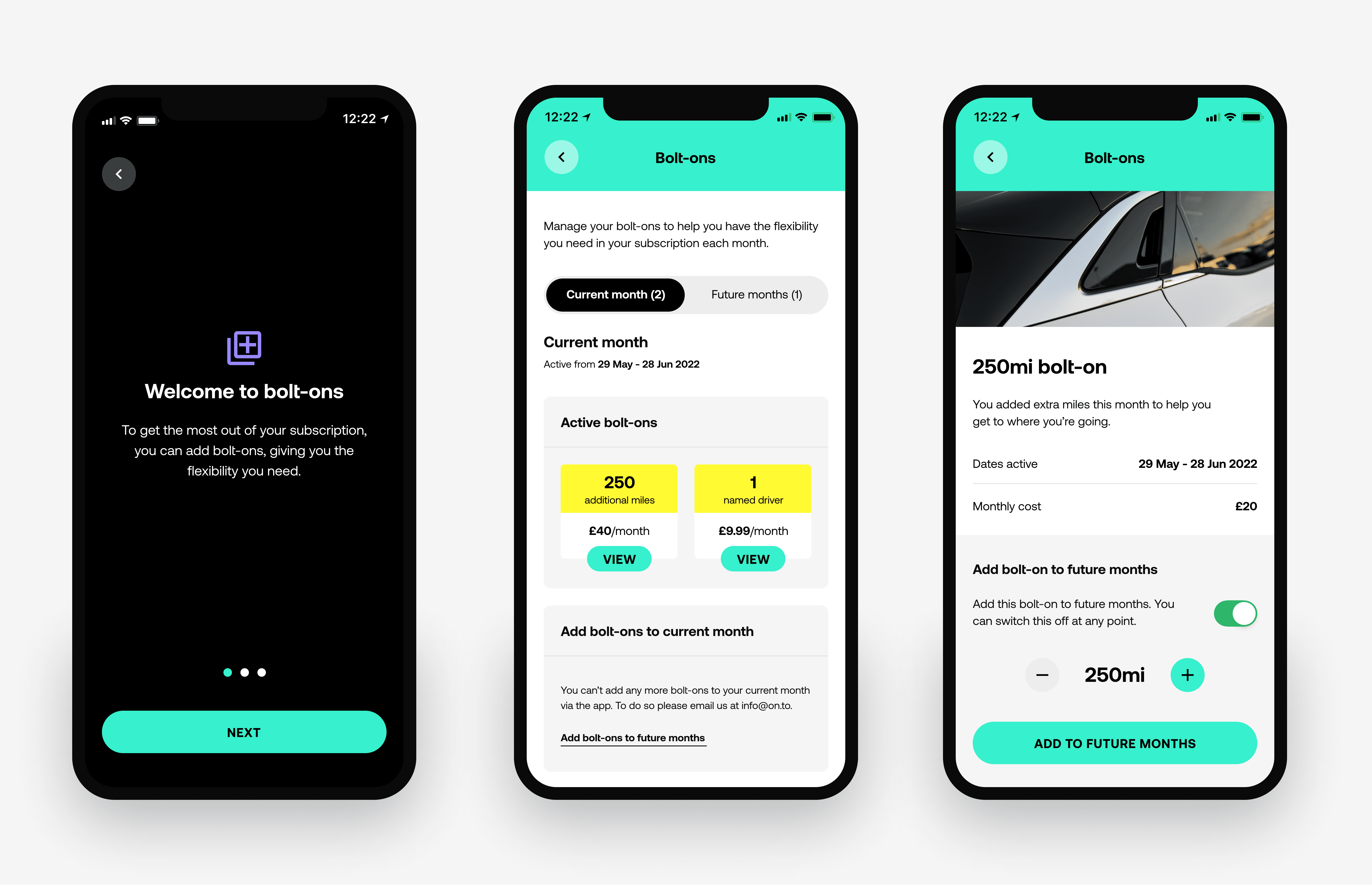
The redesign introduced a dedicated subscription hub where customers could manage monthly plans and mileage, swap vehicles, add or remove bolt-ons and track or redeem rewards.
The changes shifted the app beyond vehicle access towards an active companion for managing the subscription.
Rewards were redesigned to make their value clearer - helping customers understand their points, see what they could redeem and complete redemption with less friction.
Bolt-ons were brought into a core customisation flow, making it easier for customers to adapt their plan as their needs changed.
Embedding seamless support
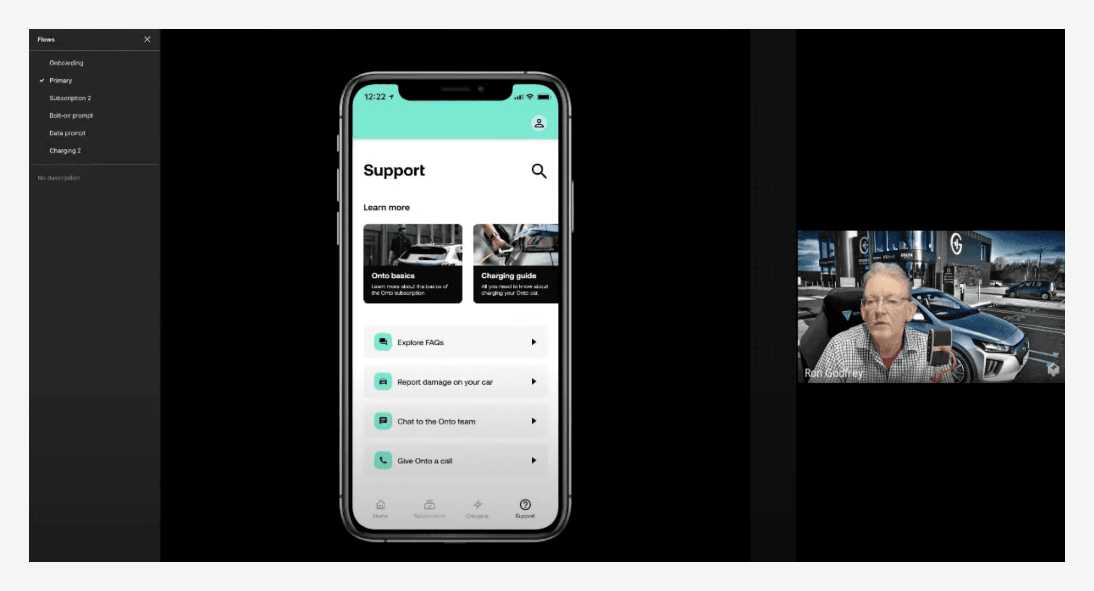
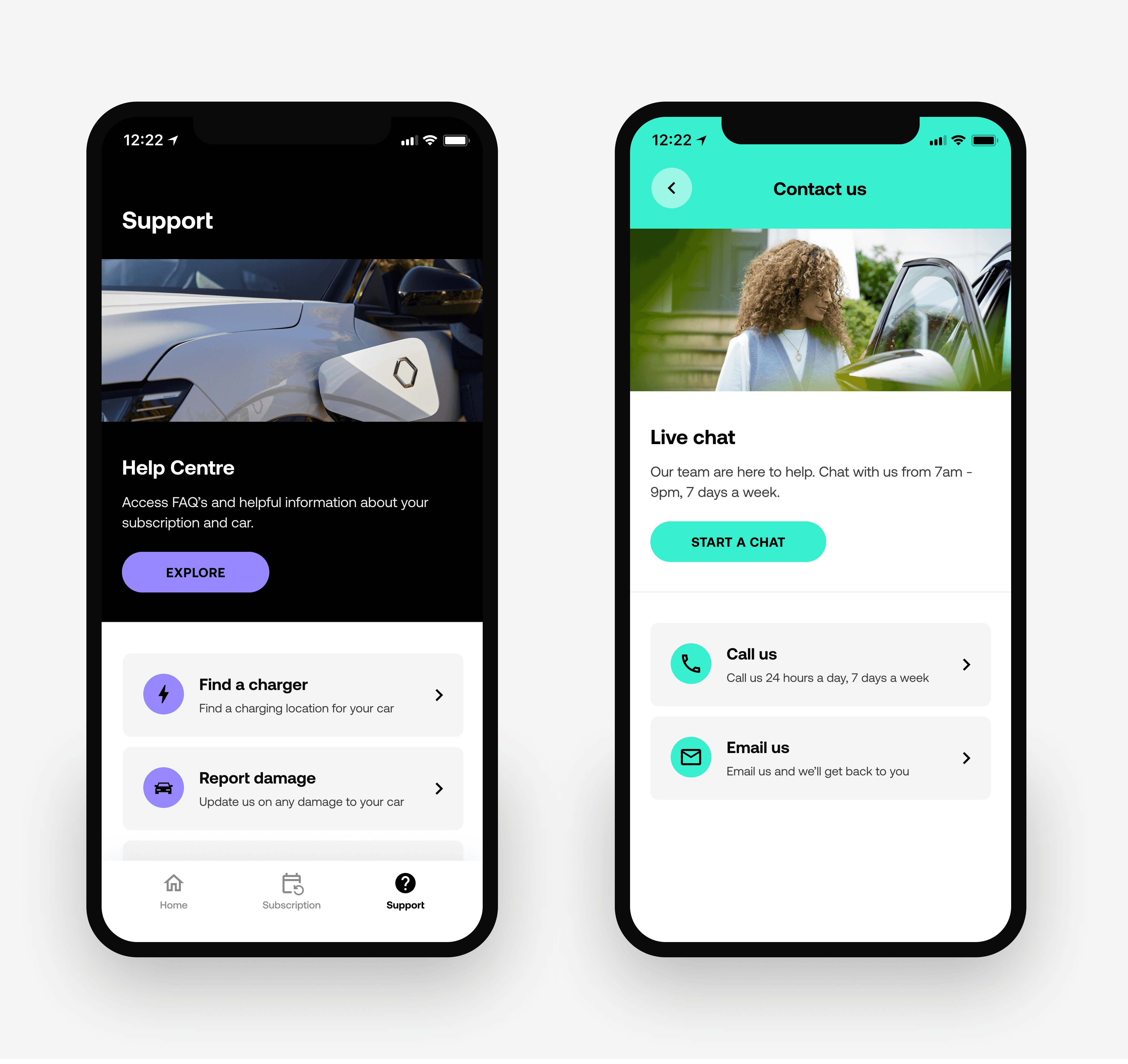
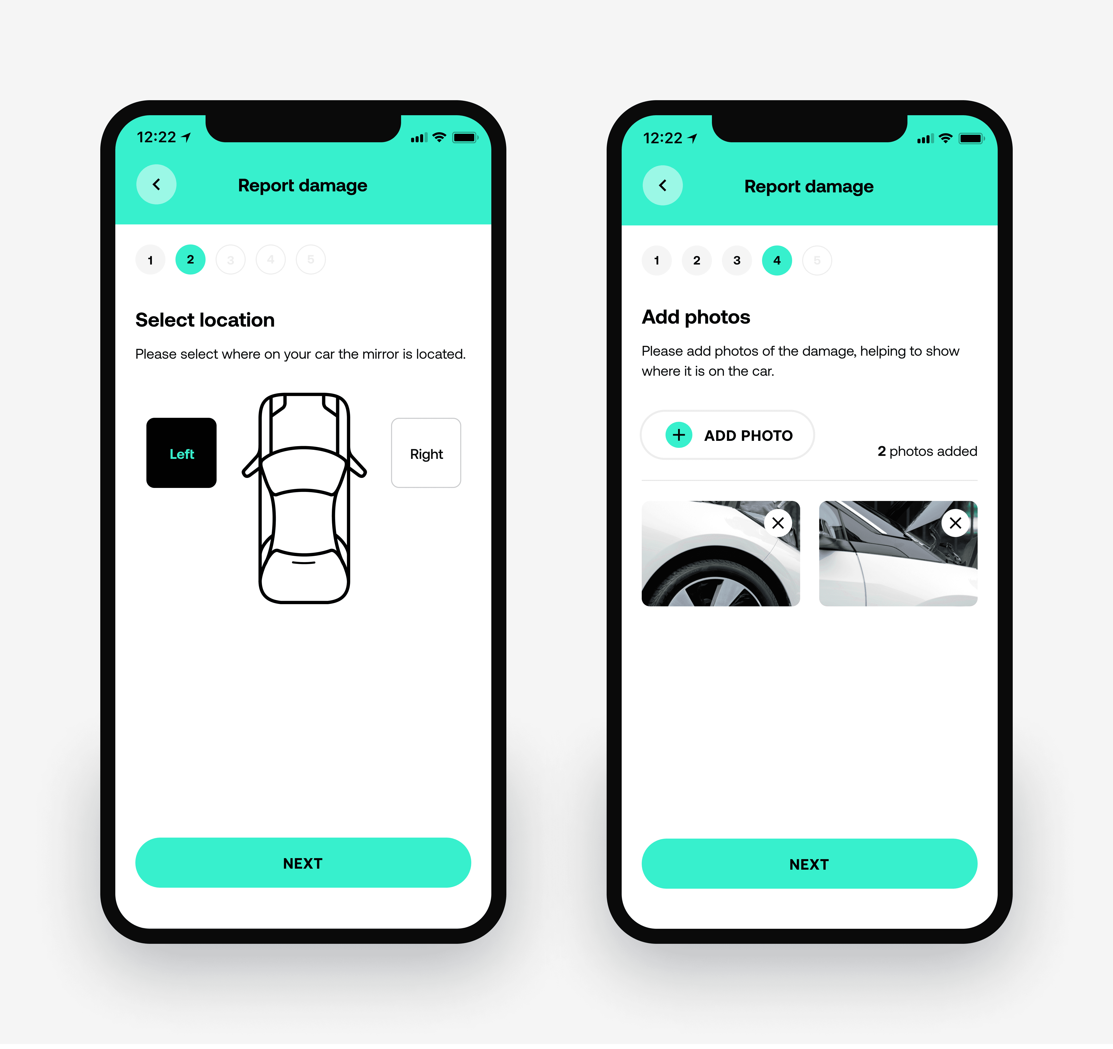
To reduce customer friction and operational load, we introduced a central support hub combining live chat, self-service content and enhanced car condition reporting.
Support was also embedded contextually across key journeys, surfacing guidance and escalation at the moments customers were most likely to need it.
Together, these changes reduced reliance on phone and email while improving resolution speed and customer satisfaction.
Outcomes
The redesign repositioned Onto’s app from a functional access tool into a scalable subscription companion - improving the customer experience, reducing operational load and creating a stronger foundation for product growth.
The redesigned experience drove a 30% increase in app engagement andcontributed to a 32% reduction in customer support cases.
Beyond the immediate results, the new information architecture and design system gave the product team a scalable foundation for experimentation and future feature development.